
If your current reporting consists of scattered spreadsheets, vanity metrics, and last-minute board deck prep, you’re not alone. Most marketing and revenue teams are tracking too much of the wrong thing—and missing the signals that connect performance to the bottom line.
To help you streamline your analytics, we built a comprehensive, field-tested guide: The Top 10 KPI Dashboards for Revenue & Marketing Leaders. Request a copy of the presentation or .pdf file here.
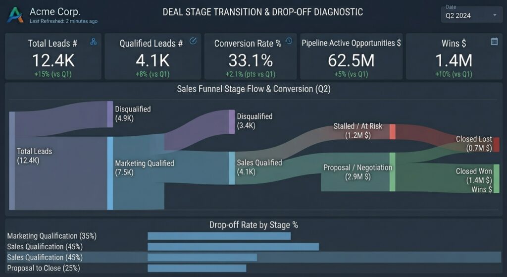
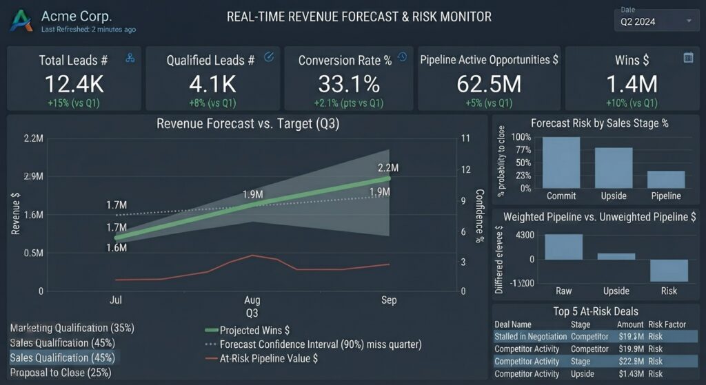
10. Real-Time Revenue Forecast & Risk Monitor
Layout: Predictive line chart with confidence intervals and risk-flagged summary cards.
Core View: Combines current Pipeline Active Opportunities Value with historical Conversion Rate percentage benchmarks to project end-of-quarter Wins Value.
Key Use Case: Early warning system for revenue shortfalls, allowing leadership to ramp up lead generation or accelerate mid-funnel deals ahead of quarter-end.
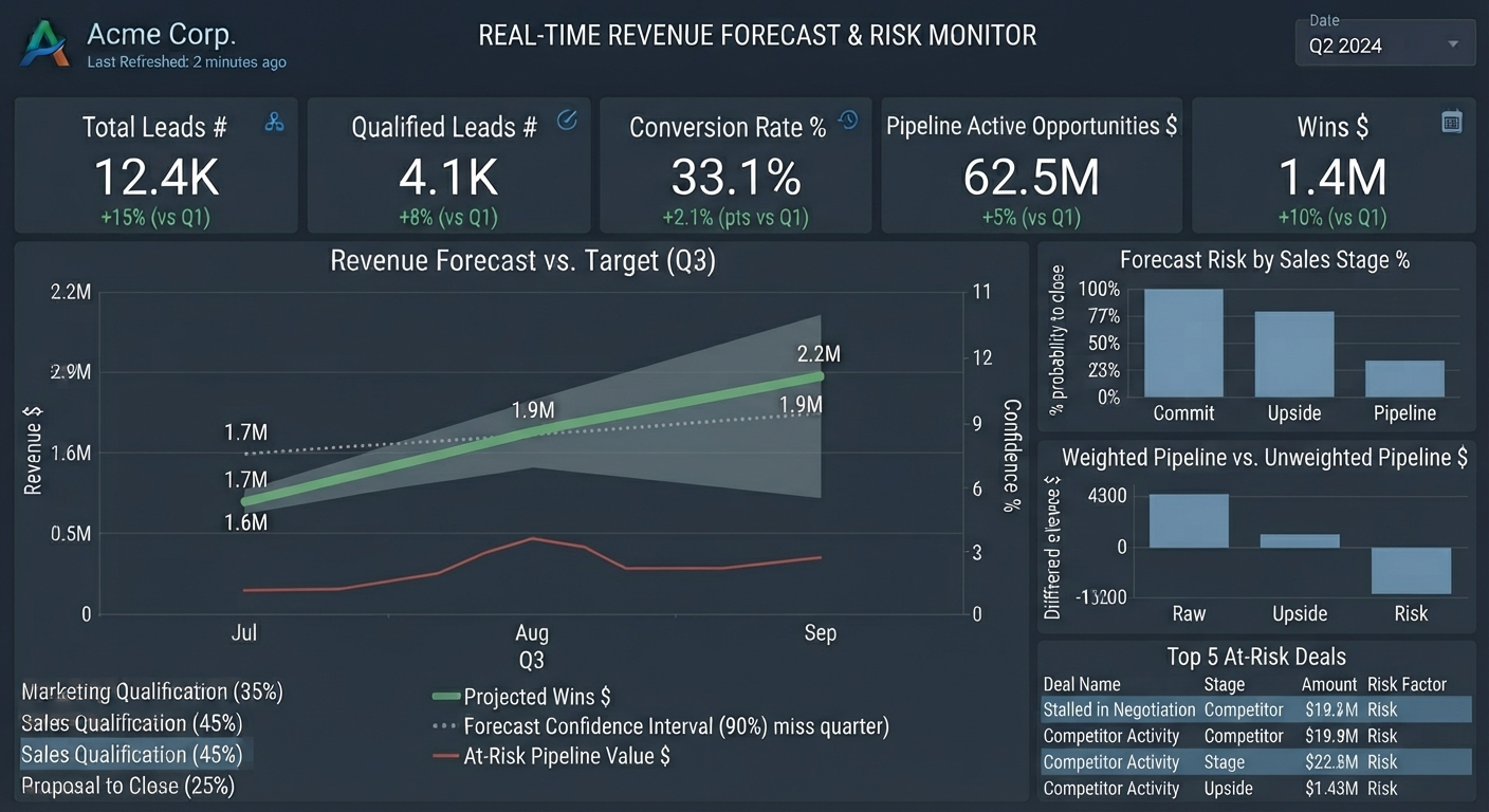
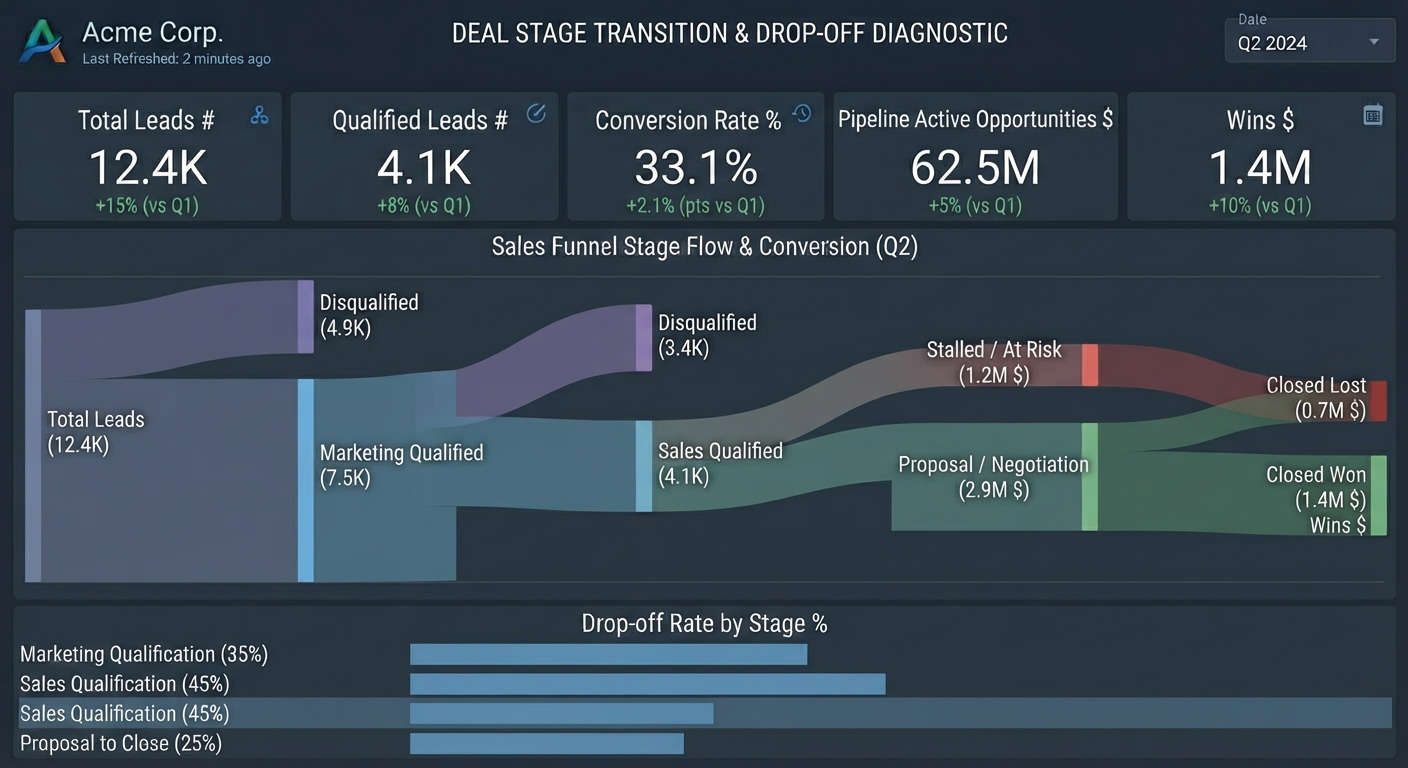
9. Deal Stage Transition & Drop-off Diagnostic
Layout: Sankey diagram or left-to-right flow chart.
Core View: Maps out the precise movement of Leads count through qualification milestones and active pipeline stages right up to Wins Value.
Key Use Case: Pinpointing exact drop-off points in the mid-funnel where opportunities stall or fall out of active pipeline.
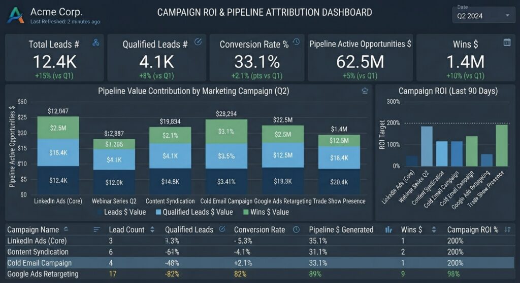
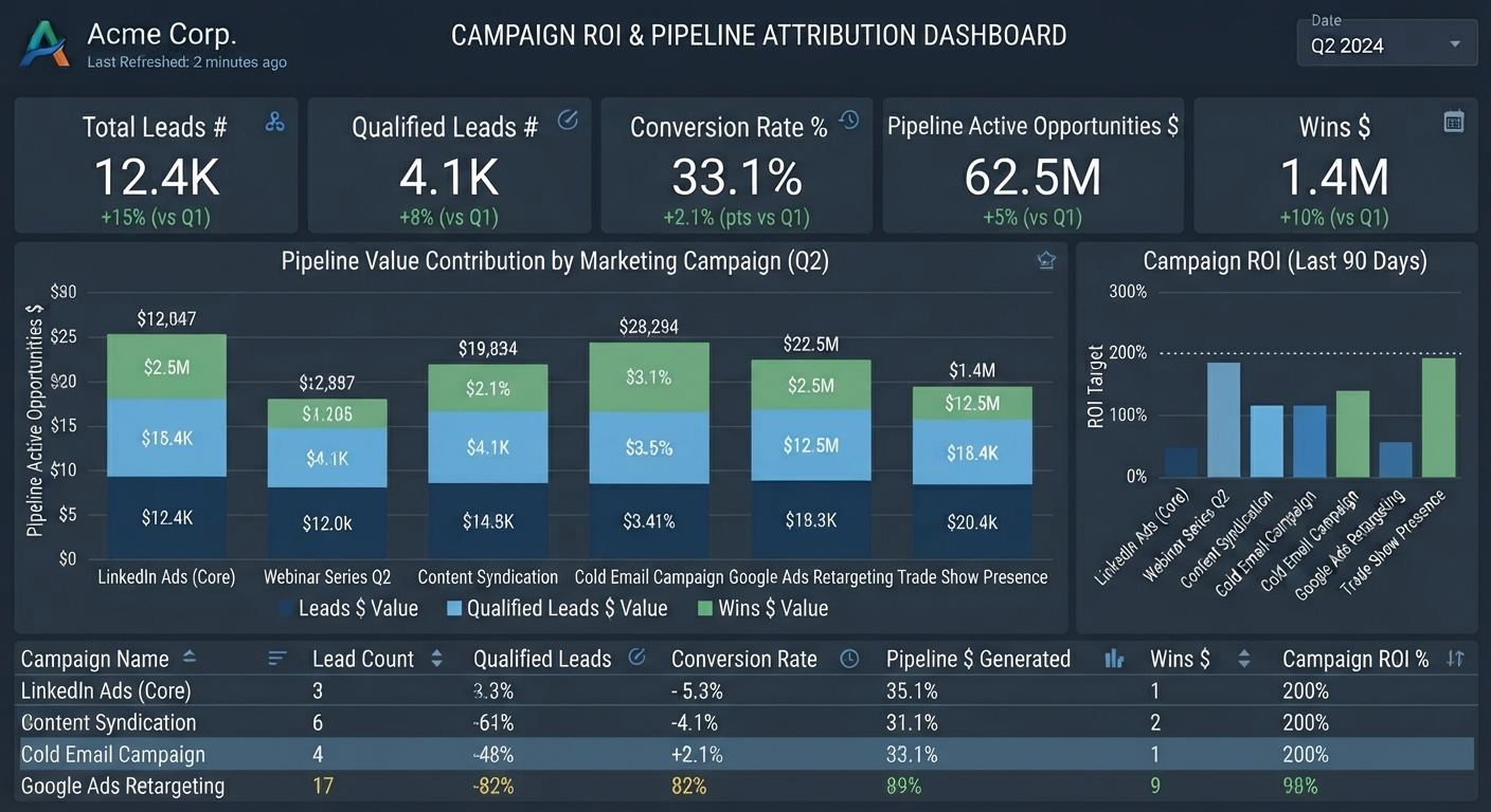
8. Campaign ROI & Pipeline Attribution Dashboard
Layout: Filterable data table stacked beneath a stacked bar chart.
Core View: Traces marketing attribution from initial Lead Count all the way to closed Wins Value, showing which campaigns generated the highest-value Pipeline Active Opportunities Value.
Key Use Case: Proving marketing ROI and aligning marketing and sales teams around shared revenue accountability.
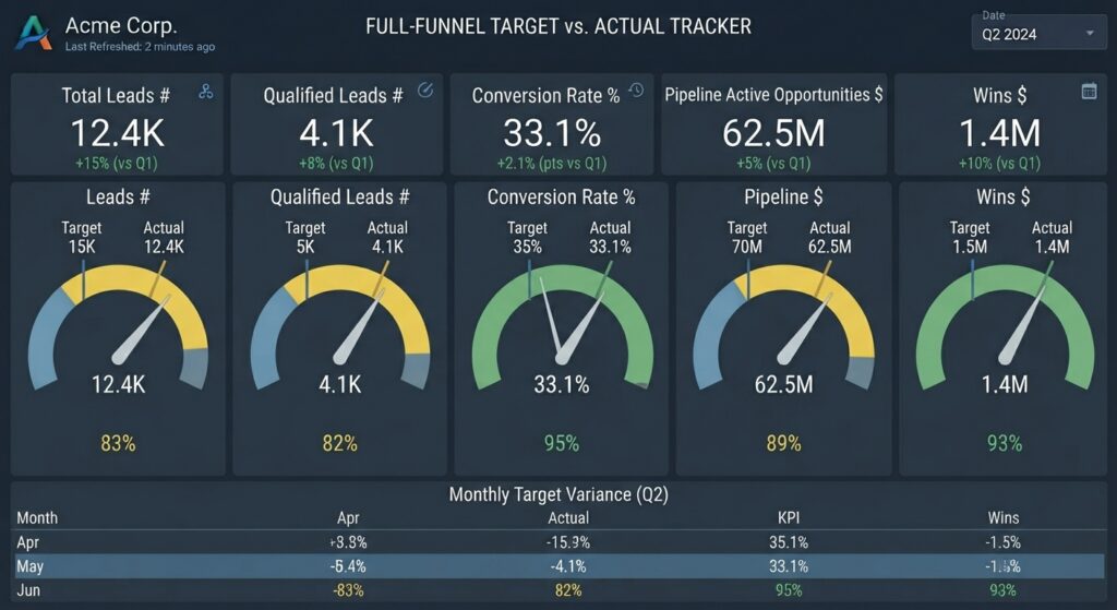
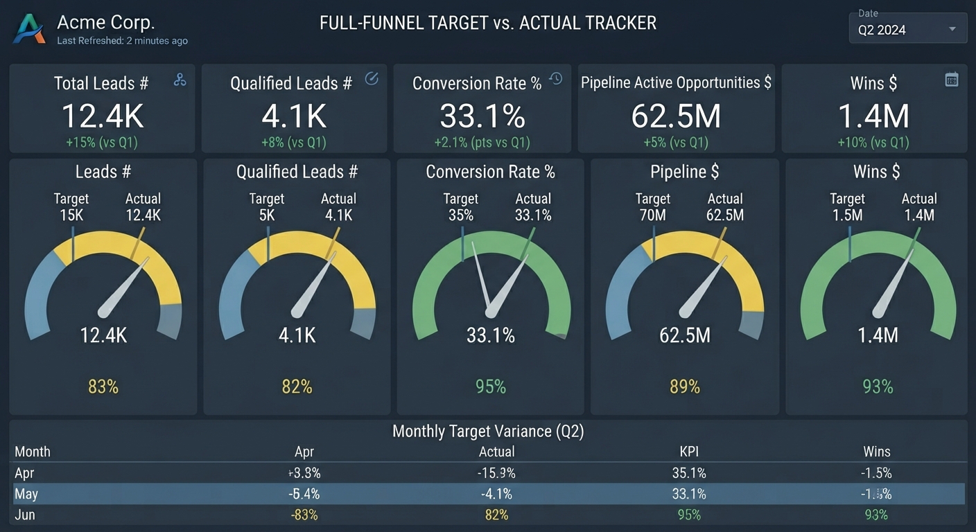
7. Full-Funnel Target vs. Actual Tracker
Layout: Progress gauges and bullet graphs for each individual metric.
Core View: Compares current-month-to-date actuals against pre-set quotas for Leads Count, Qualified Leads Count , Conversion Rate percentage, Pipeline value, and Wins value.
Key Use Case: Keeping the revenue team aligned on daily pacing goals to ensure monthly and quarterly targets are met.
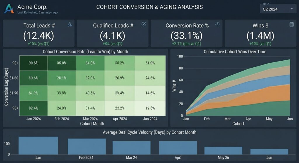
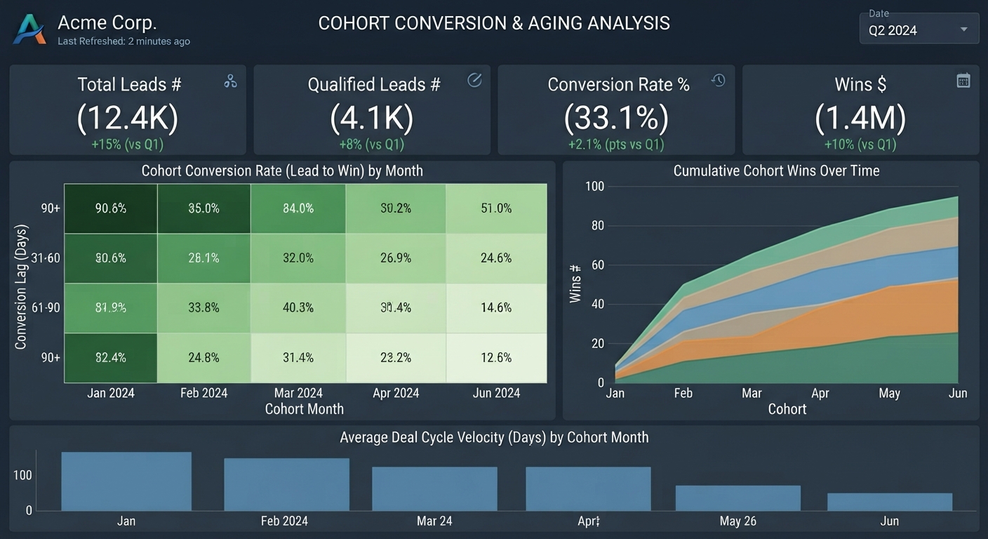
6. Cohort Conversion & Aging Analysis
Layout: Heatmap matrix combined with cumulative line charts.
Core View: Tracks weekly or monthly cohorts of Leads Count to see how long it takes them to transition into Qualified Leads # and eventually close as Wins value.
Key Use Case: Uncovering hidden sales cycle delays and understanding the true time-to-revenue for incoming demand.
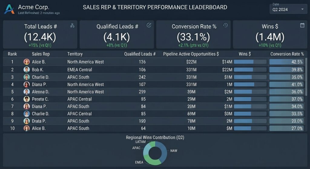
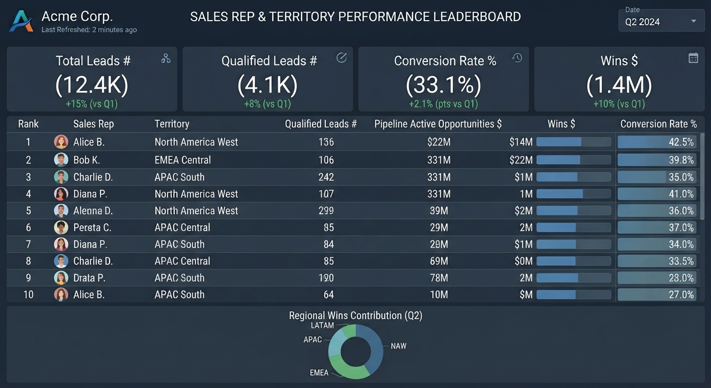
5. Sales Rep & Territory Performance Leaderboard
Layout: Tabular grid sorted by revenue, supplemented by horizontal progress bars.
Core View: Breaks down Pipeline Active Opportunities Value and Wins value by individual sales rep, team, or geographic territory, alongside their individual conversion rates.
Key Use Case: Identifying top-performing playbooks and coaching reps who struggle with lead-to-qualification conversion.
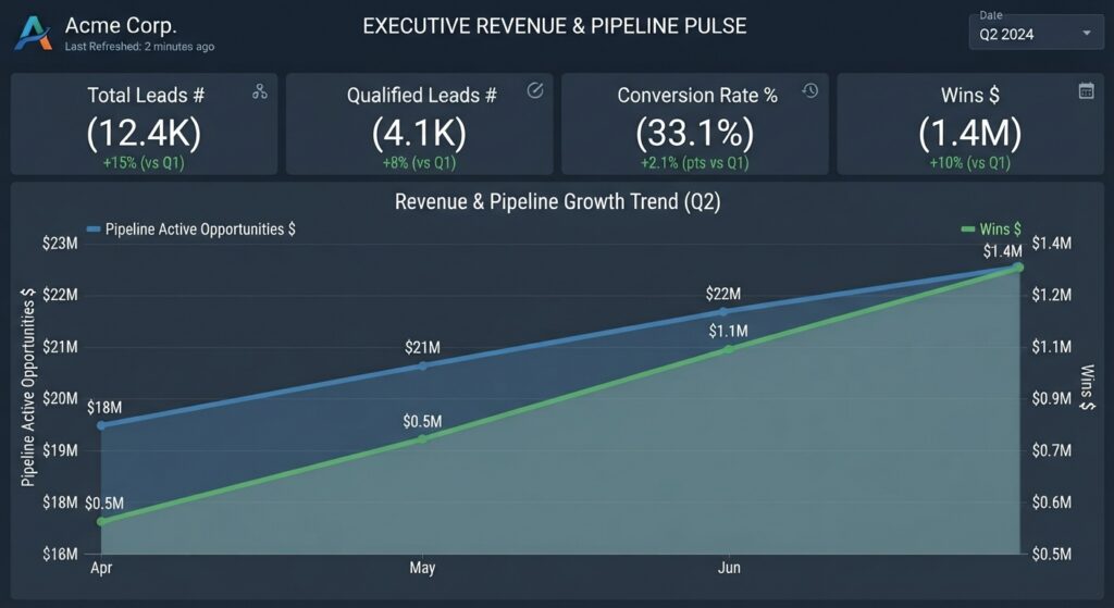
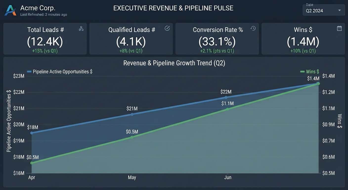
4. Executive Revenue & Pipeline Pulse
Layout: Clean, minimalist executive scorecard with large, bold typography.
Core View: Focuses heavily on top-line totals (Pipeline Active Opportunities value and Wins value) alongside period-over-period growth percentages for Leads Count and Qualified Leads Count.
Key Use Case: The go-to dashboard for executive syncs and board meetings to review high-level business health in under 60 seconds.
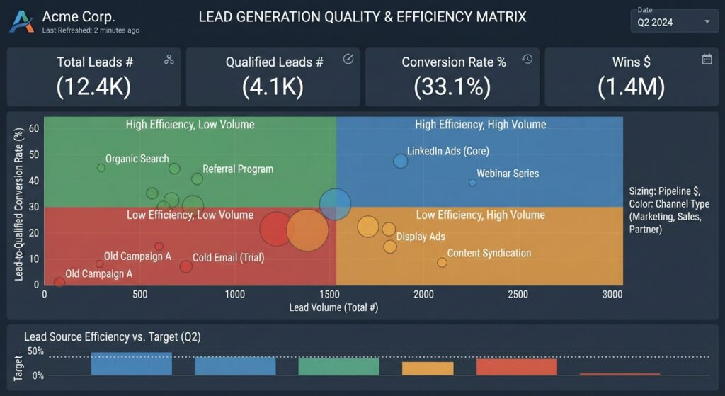
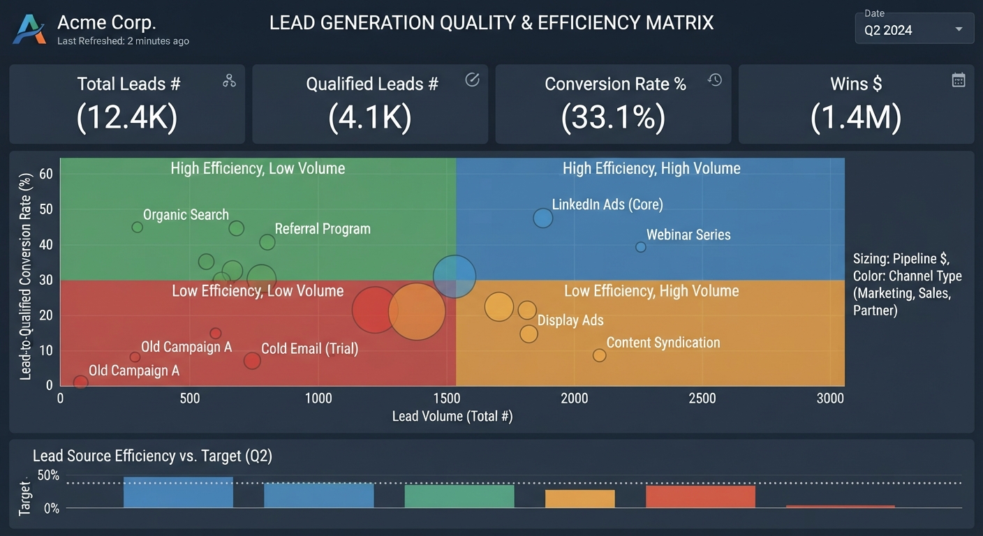
3. Lead Generation Quality & Efficiency Matrix
Layout: Four-quadrant scatter plot with summary metrics pinned above.
Core View: Plots acquisition channels or campaigns on one axis by Lead volume and on the other axis by the Conversion Rate percentage to qualified status.
Key Use Case: Shifting marketing budget away from high-volume, low-intent channels toward channels that actually generate sales-qualified leads.
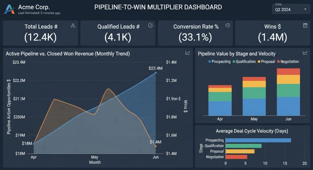
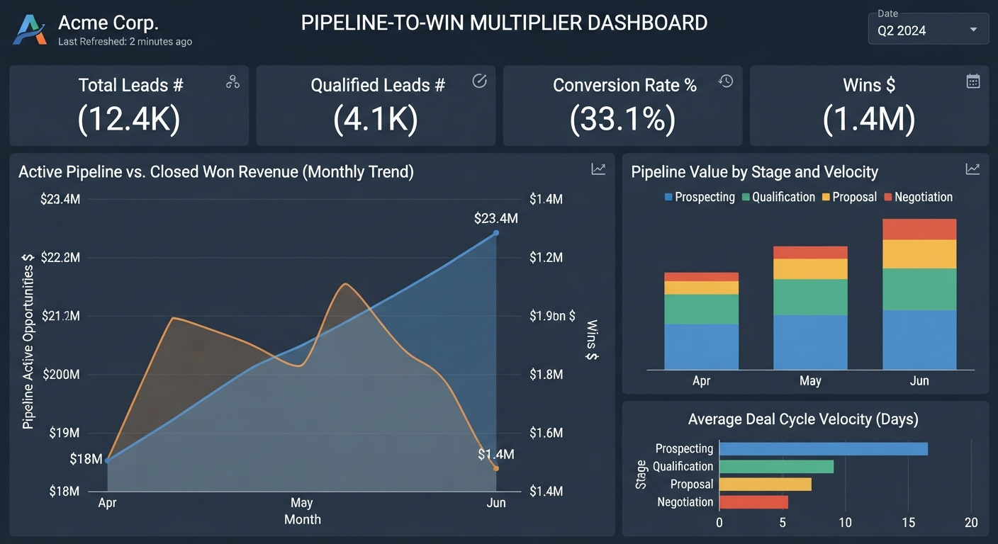
2. Pipeline-to-Win Multiplier Dashboard
Layout: Side-by-side comparative layout with dual-axis trend lines.
Core View: Correlates active Pipeline Active Opportunities Value with actual Wins Value to show your trailing win rate and average deal cycle velocity.
Key Use Case: Forecasting future revenue confidence based on active deal health and historical conversion rates.
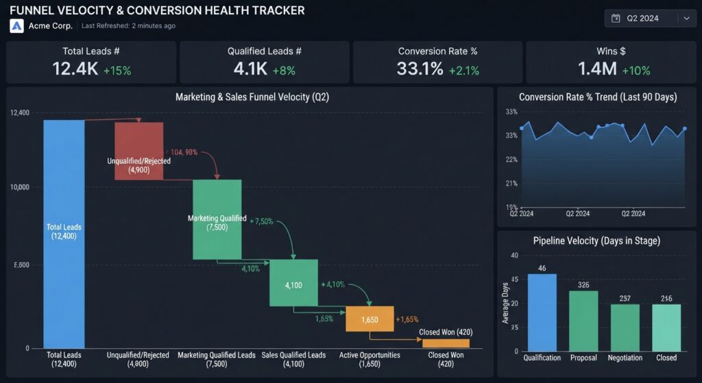
1. Funnel Velocity & Conversion Health Tracker
Layout: Top row of summary scorecards flanked by a multi-stage funnel waterfall chart.
Core View: Visualizes the drop-off from total Leads Count, down to Qualified Leads Count and Wins Value, paired with real-time conversion rate trends over time.
Key Use Case: Instantly spot where volume is bottlenecking in the pipeline before it impacts bottom-line revenue.

If you found this useful. Request a copy of the presentation or .pdf file